Website Redesign
AllSTEM Connections
CLIENT
AllSTEM Connections
ROLE
Creative Director (concept and design, collaborative execution)
FULL SITE
DELIVERABLES
Full website redesign — visual direction, concept, layout, storytelling
THE SITUATION
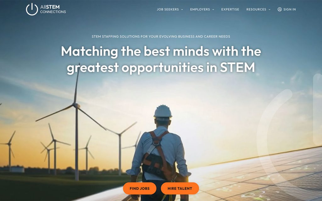
AllSTEM operates in a competitive space. STEM staffing is a crowded market, and the companies winning in it look like they belong in the same world as their clients — tech-forward, polished, confident. The old AllSTEM site wasn’t doing that. It was stark, light on content, and didn’t give visitors much reason to stick around. For a company connecting top STEM talent with serious employers, the site just wasn’t pulling its weight.
The goal was straightforward: build something that could compete. Something that felt like it understood the audience — scientists, engineers, technologists — rather than just describing services at them.
WHAT I WAS THINKING
STEM professionals are a specific audience. They’re smart, they’re busy, and they have good instincts for when something feels cheap or generic. A site that reads like a template is a credibility problem before a single word gets read.
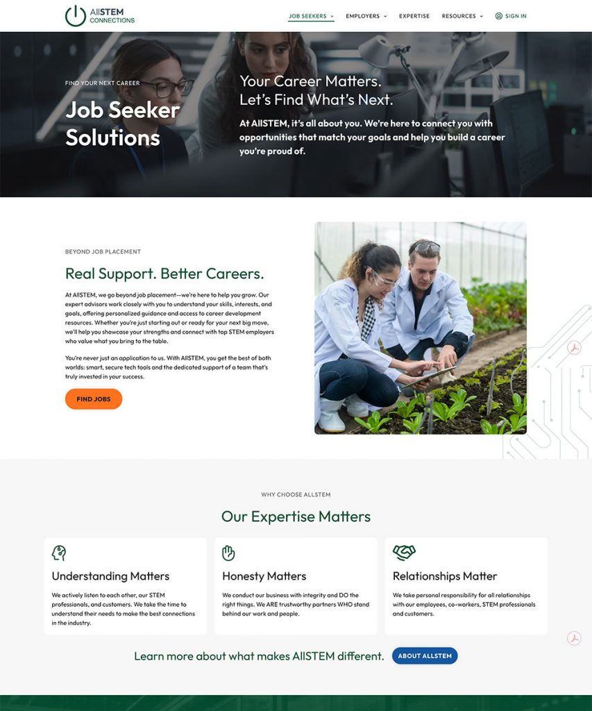
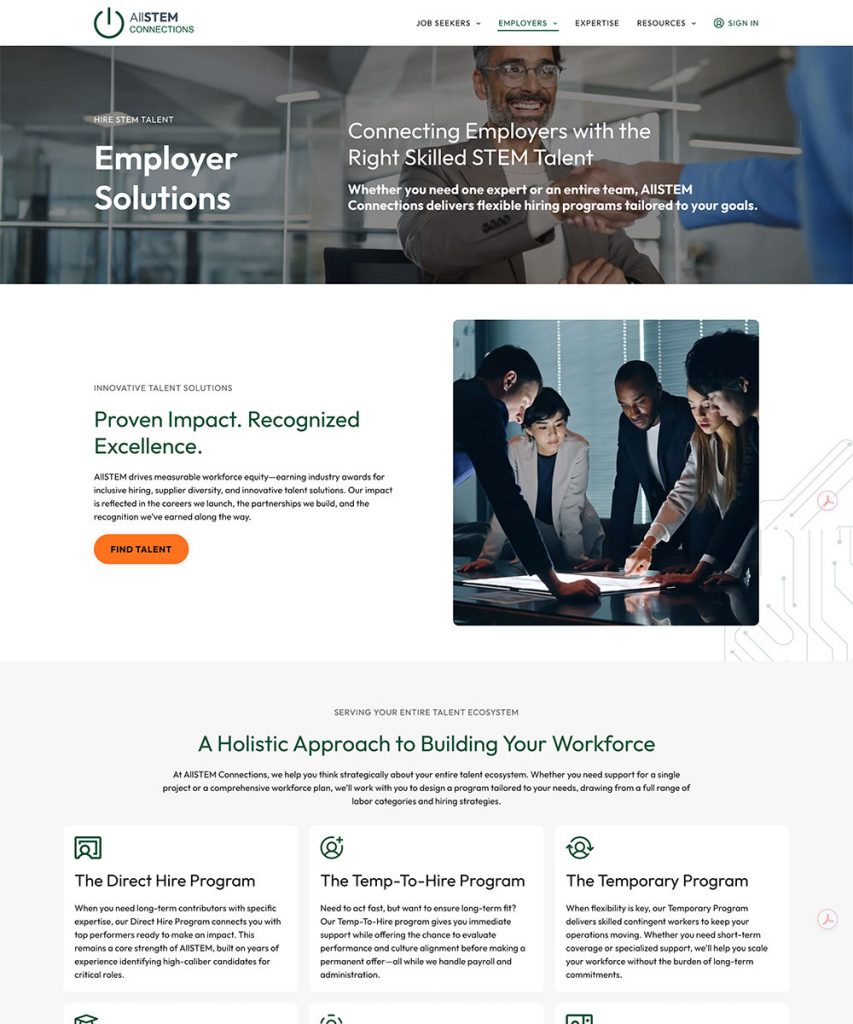
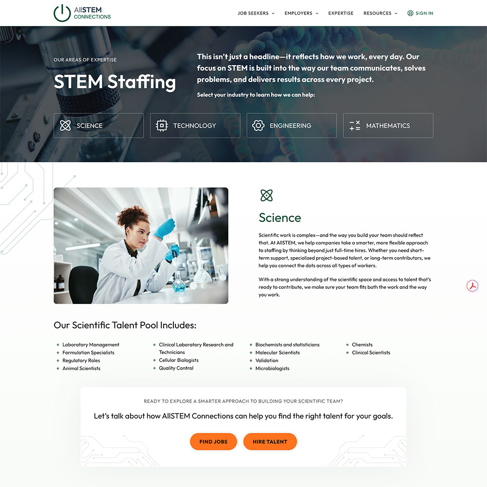
So the direction was about earning trust visually before the copy even kicks in. That means a strong, considered aesthetic — techy but human, modern without being cold. The dark hero with video sets a tone immediately. The section layouts that follow give the content room to breathe and build a story rather than just listing services.
The other thing I focused on was storytelling across the full site. The old version was sparse — a few words and move on. This needed to actually take someone somewhere. Job seekers needed to feel like AllSTEM understood their world. Employers needed to feel like they were dealing with a sophisticated partner. Those are different emotional beats, and the site needed to handle both without feeling like it was talking out of both sides of its mouth.
The redesign touched every major section of the site — from the homepage through the job seeker and employer experiences, the expertise pages, and the resources section. The visual system had to hold up across all of it: consistent, flexible, and credible at every turn.
HOW IT LANDED
The new site gave AllSTEM something to stand behind. The modernization was a full step forward — not a refresh, a repositioning. When your audience lives in the tech world, looking like you belong there isn’t a nice-to-have. It’s the price of admission.
The storytelling approach across the site meant visitors actually understood what AllSTEM does and why it’s different, instead of just skimming a homepage and bouncing. That’s what a good website is supposed to do.
SKILLS
Creative direction · Web design · Visual identity · Concept · Layout · Storytelling · UX thinking